Bridging Clients and Editors: Transforming the Review Tool for Collaboration

Evaluating the SaaS Collaboration Tool for Video Creation and Enhancing Its Usability for Two Different User Groups
Date: 2024
Duration: 4months
Client: Eddie

What is the review tool from Eddie?

Imagine you're a communication specialist tasked with creating an engaging video for your company's internal or external communication. You hire a video creator, but when it comes time to provide feedback, the process feels frustrating. Explaining your feedback via email is time-consuming, and it seems to slow down the entire project, leading to unnecessary delays and confusion.
That's why the review tool from Eddie is needed. Eddie’s review tool is essential for streamlining the content feedback process. As a SaaS platform, Eddie connects editors with clients, allowing them to share videos and documents, leave comments, and track revisions efficiently.

Supporting our developing team: addressing inefficiencies and optimizing features

This platform has undergone gradual enhancements, so the design team “assumed” it is not “efficient” and there is a need to streamline and restructure its features. Also, they wanted to optimize features.

I started to verify our design team’s assumption by desk research

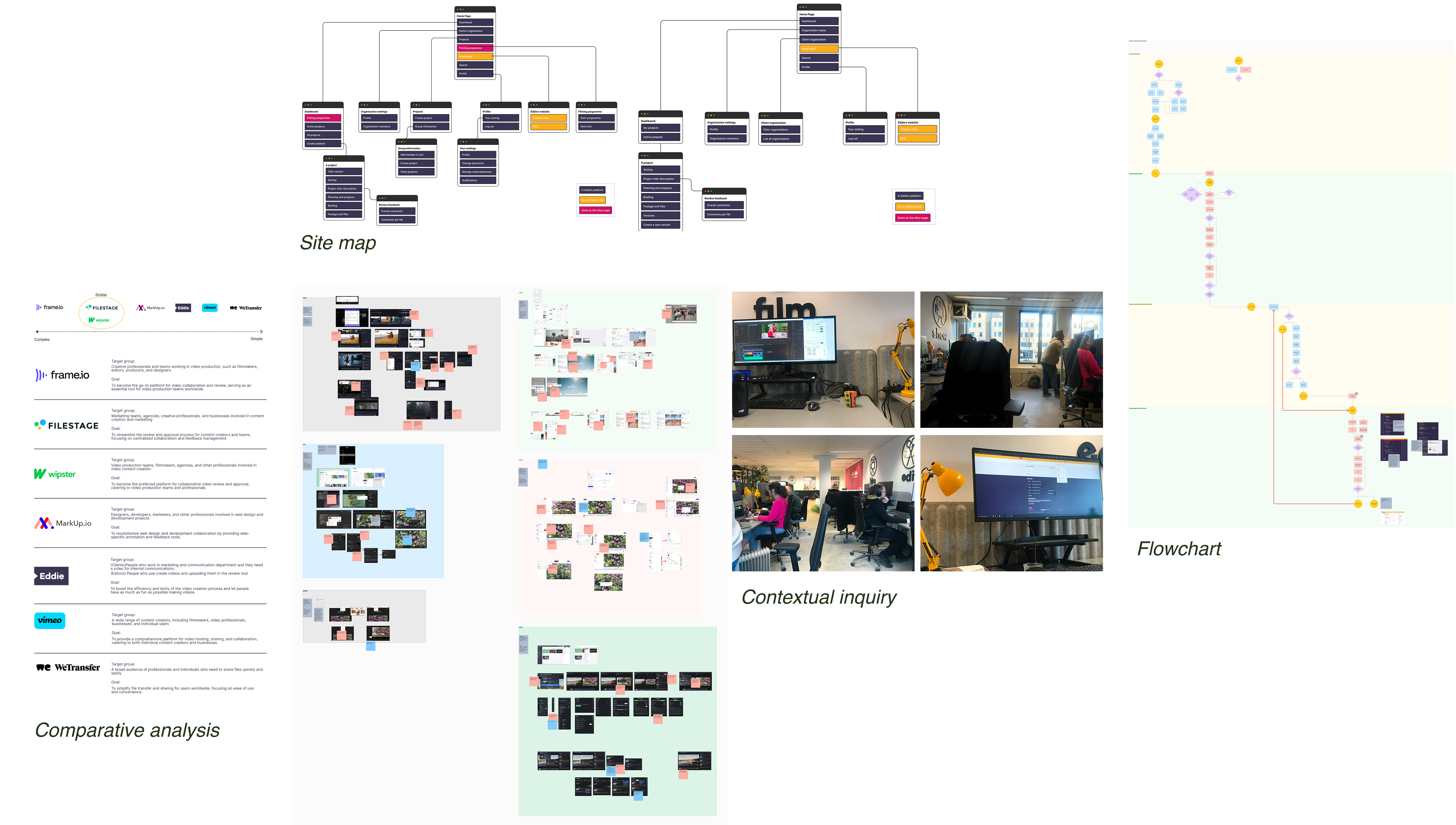
I first worked on verifying my design team’s assumption, this platform is not efficient and user flow is not optimised. To do so, I did a desk research and found duplications and user flow pain points.Also, to consider optimising features, I did a comparative analysis. This allowed me to identify similarities, differences, and areas where Eddie’s tool might be lacking or excelling.

Next, I dive into user research to understand users and verify my findings from desk research

Since this is a multi- sided platform, I conducted user research for each user type separately, allowing me to uncover specific insights tailored to their unique needs and experiences.
Survey
  • Clients: The objective of this survey is to understand how users interact with the review tool on Eddie’s platform, how corporate users collaborate using the tool, and how they work with other agencies during the review process.
  • Editors: The objective of using this survey method is to identify which functions editors use for specific tasks in the review tool's features. Additionally, the survey aims to gather qualitative data on editors' wishes and needs for potential new functions, inspired by best practices from competitors.
Interviews for the clients

I was not able to collect the target number of survey responses from clients, so I focused on the key insights that emerged. To validate and expand on these findings, I conducted interviews with some clients to explore how they envision using the features and gain a deeper understanding of their needs and preferences.

Usability test for the editors

Usability testing was conducted after reviewing the outcome of the survey. This is because it is possible to ask editors follow-up questions in person based on the survey findings and confirm their behaviors with the findings from the survey. During my desk research, I conducted a contextual inquiry to understand how editors work with the platform in their actual environment. On the other hand, this usability testing focuses specifically on the review tool.

Why did I choose interviews for clients and usability testing for editors?

After user research, it’s show time to extract user insights from my research

How did I analyze the research data?

Each research activity provided valuable insights. To validate these findings, I created an affinity diagram to identify connections between data points from different research methods.

Key insights

Editors

Editors are highly engaged with client feedback because it directly impacts their work quality and revisions.
Editors need clear and readable feedback to quickly understand and act on client requests without misinterpretation.
Editors want a way to track completed feedback efficiently to stay organized and manage their workflow.
Editors need better communication tools to justify rejected feedback and maintain a smooth collaboration with clients.

Clients

Clients are eager to watch videos from a new version because they want to see how their feedback has been implemented.
Client satisfaction depends on the quality of the latest version as it directly impacts their workflow and expectations.
Clients want an easy way to edit or delete feedback to correct mistakes and refine their input efficiently.

Personas

From user insights to prototypes: how to transform user insights into prototypes

Testing with users to validate design and uncover pain points

Clickable prototyping was created with the final idea and it was tested with both user groups. User testing was conducted to assess the usability and functionality of the prototype in a controlled environment. Also, it helps to understand what they like about the new desing to see user satisfaction, preferences, and overall experience. This process helps uncover usability issues, gather insights, and validate design decisions.

I found some points to improve, for example...

How to enlarge or shrink the video screen
This feature itself is handy for users. However, the position of this button is in the right corner of the video, so it is hard to see depending on the color of the video. Also, there is an icon to make a video full screen as well. Therefore, users were confused about which one they should select.

Expert Insights for alignment & improvement

I utilized the expert review method by presenting my clickable prototypes to my mentor, who serves as the creative director, and the tech lead, who is the developer.
Given their extensive experience of over 5 years working on this platform and developing is design, it was crucial to evaluate my designs with these experts to gain valuable insights beyond just user feedback. Also, it ensures alignment with the platform’s overall objectives, and refining the prototypes based on both technical and creative considerations.

Design Rationale

1. Smooth user flow to reach user' first main activity in the review tool

I removed the pop-up screen to improve the user flow for editors and clients, who were switching between pop-ups and videos due to a disorganized layout. User research revealed their opposite priorities: editors focus on feedback, while clients prioritize watching the videos. To accommodate both, I kept the same interface but adjusted the content size—editors see a smaller video with a larger feedback list, while clients get a larger video with a narrower feedback list, allowing them to watch videos first and then provide feedback smoothly.

  • Clients are excited to watch videos from a new version.
  • Editors are curious about the feedback from clients.

(Before)

Step1
First, editors need to scroll all the way down and click the button to open the review tool
Step2
In the review tool, the pop-up appears. Editors can click the timestamp if they want to check the video.
Step3
Then, it goes to the video. Editors can check the feedback on the right side as well. However, they want to go back to the pop-up because it is easy to read.

(After)

Step1
The feedback button is on the top of the project pace. Editors can easily access to the review tool to check feedback.
Step2
In the review tool, they can read feedback clearly. Insight: Editors need good readability to check feedback

2. Possible to adjust video size based on users' occasions

Since editors and clients have different initial priorities, the video size in the review tool varies for each. Editors focus on feedback, but sometimes need to enlarge the video to check specific comments. Clients prefer a larger video for viewing but can also adjust the size when needed. A size adjustment bar allows both users to change the video size as required. For lead clients who moderate feedback, a smaller video and wider feedback list make the task easier.

One click to change the size

The adjustment bar appears when users hover between the video and feedback list, allowing them to resize the video without leaving the page. Since it only shows on hover, it doesn't disrupt their main activities.

3: Easy to switch variations

Insight: Clients want to switch variations easily
In a project with multiple variations (videos or images), clients struggled to switch between them. They sometimes leave feedback on the wrong variation. Survey research highlighted the difficulty, with one participant mentioning challenges in switching and another noting mistakes in video selection. To improve the user flow, the design for switching variations needed to be made clearer and more accessible.

(Before)

In the original design, users could switch variations in two ways: by clicking an arrow in the top right to display the variation on the side, or by clicking a button in the bottom right to open a pop-up, then selecting 'Add feedback' for the correct variation.

(After)

Clients can easily switch variations on the above of a video frame. On top of that, they can click the image on the right side of the feedback list and the variation will be switched. These are on the same page deleting extra steps.

4: Easily see how much feedback  editors have processed

Insight: Editors want to quickly understand the amount of completed feedback.
Editors need an easy way to track client feedback and monitor their processing status, marking feedback as accepted or rejected. User research shows that knowing the total feedback and confirming which items have been addressed is essential for improving videos and enhancing productivity. They also want to ensure they don’t overlook any feedback points, as this impacts their work quality.

What’s next: aligning visuals and preparing for implementation

Research and Flexibility

The team is currently working on aligning the visual design with the brand. Once the final version is ready, it will be presented to investors to assess the feasibility of implementing the new designs